

Summary
Our product team was challenged with making the mobile experience more useful for our field users. After interviews, field visits, and digging into google analytics, we decided to surface the items that were most important to our users.
Discovery: Google Analytics, user interviews, and field observation.
Solution: The solution included surfacing the most important information, allowing users to search for projects on the dashboard, and adding the ability to work offline.
Design: Design workshop, two rounds of ideation, and two rounds of testing.
Outcome: 206% increase in unique dashboard usage.
Overview
Team: Product Manager, Co-designer, Developers, Sales, and GA Design Student
Role: Research, Facilitation of Design Session, Wireframes, Design, Prototype & Usability Testing, Acceptance Criteria, and User Stories
Outcome: Updated Dashboard
Timeframe: 2 Months
Research: 7 users
THE Hypothesis
We believe that a dashboard exposing the most important information will result in more engagement from our field users because analytics show that few users are using the dashboard and users interviewed report that the dashboard in its current state is overwhelming and unhelpful.
Discovering the problem
Google Analytics
Upon investigation of the data, we discovered only 378 unique actions on the dashboard. This figure was well below our expectation, so we decided to expand our understanding of our users needs through interviews and field observations.
User Interviews
I conducted five user interviews and observed two different teams in the field. The following were the top issues I discovered:
Checking on Issues
When I asked users to walk me through their day, they all said the first thing they did was look for emails, texts, and phone calls to see if they had items that had been rejected.
Overwhelming or Useless Information
When asking interview questions like, “what does your typical project assignment process look like?” I learned that their jobs were awarded to them in the beginning of the year, so seeing that they had 2,000 tasks to complete was useless and overwhelming.

When I am in the middle of nowhere and my connection is bad, I need to make sure my work doesn’t get lost.
Data Usage
Users were worried that too much data was being used by Active Oversight and that the documented work wouldn’t be saved if they lost or experience a poor data connection.
Searching Projects
While observing users on mobile device, I noticed the first thing they did was to use the bottom tab navigation to go to their projects page so they could search for their projects. They weren’t even looking at the Dashboard.
design Workshop
After we discovered the most important information to include on the Dashboard, I facilitated a two hour design workshop which included a designer, product manager, CTO, implementation engineer, a developer, an intern, and a General Assembly UX design student.
The design session included the following exercises:
Sharing ideas
Co-Design
Presentation of ideas
Synthesizing data
Sharing research with the participants
Set goals for the session
How might we statements
Individual sketching


The solution Proposal vs. What was developed
After presenting a collaborative sketch to our stakeholders based on the ideas generated from the research and ideation sessions, we were told that they loved the design, but that some items on another feature had come up, and they had to allocate points for this roadmap item to another one. We had pare down on our features and compromise on the MVP of others. The following were the proposed vs developed items.
Fully Developed
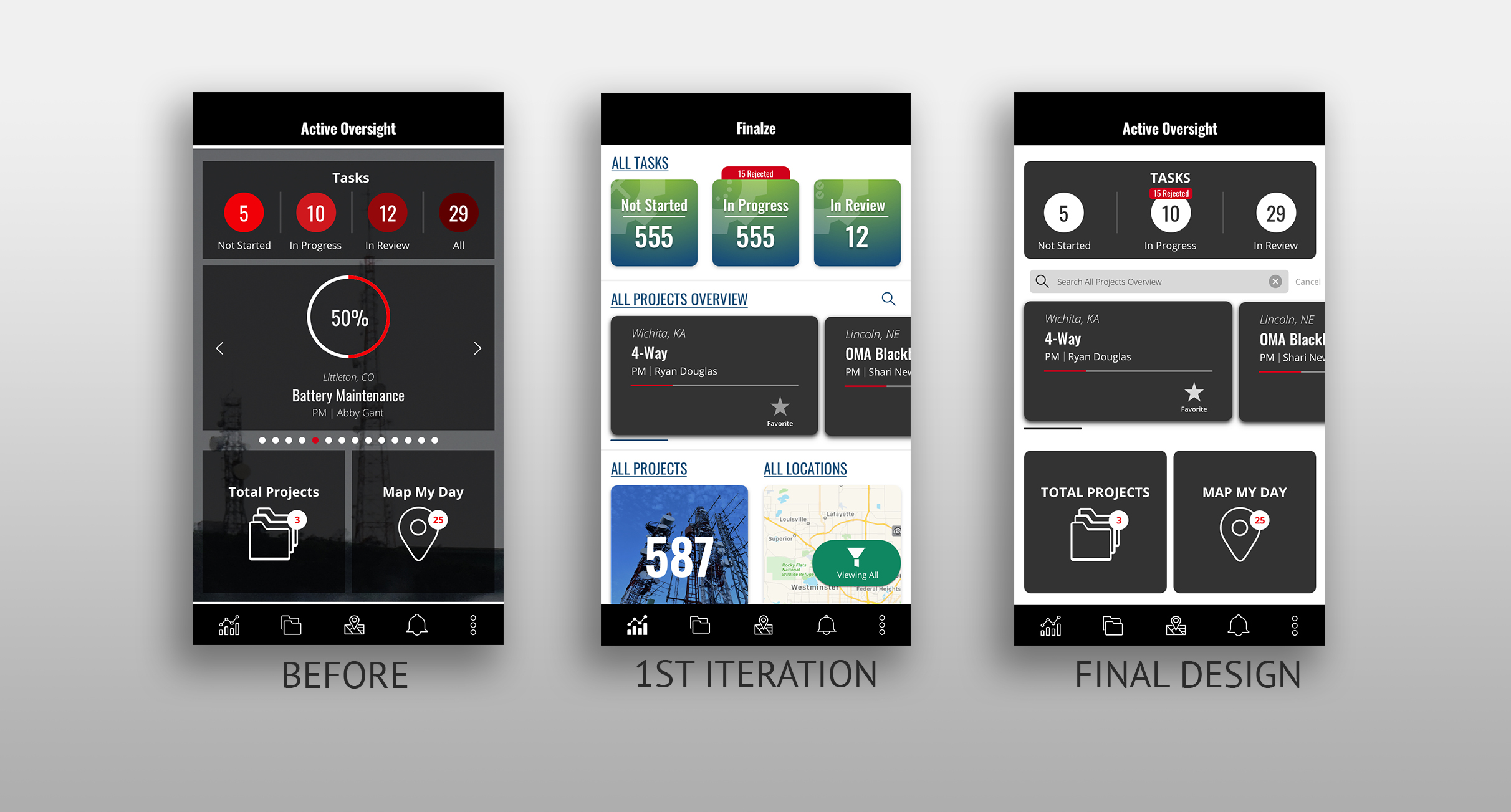
Searching Projects From the Dashboard
Outcome: Finding and working on projects seemed to be the most important task when on the mobile application, so surfacing a search of projects was approved.
Taking Away Unimportant Information
Outcome: In order to help users see what they were working on and projects that had been assigned to them, we wanted to only show the tasks most relevant to them.
adjusted & Developed
Offline Mode
Proposed: The ability for users to work in in offline mode.
Outcome: While we didn’t have the ability to allow all projects to be worked on offline, we allowed for projects to be favorited in order to be worked offline.
Rejected Tasks Flag
Proposed: Because users want to take care of any issues first thing, we should surface the rejected completion steps on the Dashboard.
Outcome: Because logic had to be changed to separate completion steps from tasks, I proposed that we flag “In Progress Tasks” on the Dashboard.
Redesign of Dashboard
Proposed: A full redesign of the Dashboard with a totally updatedUI.
Outcome: We made small changes to the UI.
Not Developed
Filters State Saved on Dashboard
Proposed: If a user filters project on their projects list, it will be reflected on what shows on the Dashboard.
Outcome: This did not make MVP.
Load Projects by Proximity
Proposed: We wanted the projects that were closest in proximity to the users to be filtered to the Dashboard and top of project list.
Outcome: Because this included the ability for our app to geolocate, we weren’t able to get this in. We decided to allow our users to manual favorite projects to filter projects to the beginning of the projects list.
Outcomes
Three months after launch, during the month of March, the use of the Dashboard skyrocketed from 378 unique actions to over 1,150 unique actions, a 206% increase in usage. This includes all actions from the Dashboard, and not just the items we’ve changed or added.
Google Analytics for each item included from March 1 to March 31, three months after release.
Favoriting: 29 - Search From Dashboard: 193 - Selecting Project Card: 364 - Selecting Rejected Tasks: 103
Design Iterations
Feature Retro
What went well
Use of the Dashboard went up and exceeded our expectation.
Thinking creatively on how we could surface rejected tasks without adding a massive amount of scope, but still alerting users that they had rejected items on the Dashboard.
Using the ability to favorite a project to enable users to work offline.
Great design workshop with people from throughout our company as well as a guest.
What could have been better
Asking more questions with our stakeholders, product manager, and developers, and understanding scope before the ideation session.
Better animations and feedback of favoriting projects actions.
Better communication with implementation when rolling out favoriting, and how that allowed users to work offline.
What we’re doing different
So we didn’t waste time over designing in the future, I implemented a pre-elaboration with developers and product manager to ensure we understood scope.
I am currently working along side our developers to create documentation on a better handoff process and ways they can take animation .json files and plug and play them into our code base.
As of this past quarter, we are creating animated release notes with how new functionality works. We have also hired a customer relations person to close the loop on user feedback, so they know when things they’ve requested are developed.
Personal Reflections
What I was wrong about: While my team was convinced that we could change our users’ behavior of using the Dashboard instead of going to the Project List to search for projects, I was skeptical. I was also wrong. We, in fact, exceeded those expectations and users searching from the Dashboard outnumber those searching from the project list – AWESOME!
What I learned: Based on analytics and interviews, I have concluded that users don’t understand what favoriting a project does and why it’s important. I’m bummed that our favoriting feature isn’t doing as well as we had hoped. Since then, one of the first things we plan for, is how our users will learn about a new feature. I also learned that while we were using favoriting as a way to store projects offline, that is not a common pattern and we shouldn’t have thought our users would catch on to that it.
I also learned that some of the analytics we are tracking are useless. For instance, we are tracking when a user goes offline. At first we were super excited that so many people were working offline, but, when compared to how many people were favoriting their projects vs the thousands of times users are getting put into offline mode, we realized that the analytics were were tracking were useless, when thinking of the positive changes we were making in our customers lives. The good news is that it does give us feedback that our users are often times in poor connection areas, which has made the ability to work offline without favoriting a project high on our priority list.
What I’m most proud of: After my research, I knew that the most important thing we could do with are Dashboard was surface rejected completion steps. When I was told that there was no way we could separate our task vs. completion step logic with the scope we had allocated, I put on my thinking cap. When I was brushing my teeth (the time when my most brilliant ideas come to me) I thought - what if we could just tag our in progress tasks with the number of tasks with rejected completion steps in them! I was so happy that we were able to come up with a solution that fit within our budget and gave the users the information that was most important to them.


