
From Requests to the Real Problem
Low engagement is often treated as a signal to add features or redesign an experience. Without understanding why a product is being avoided in practice, building more can increase complexity without improving usability.
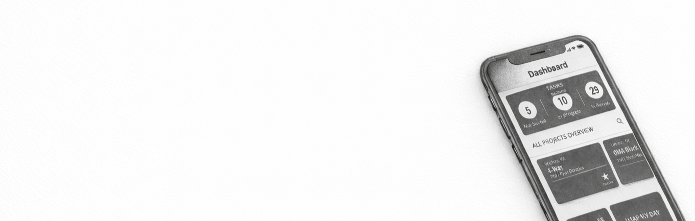
In this case, early analytics suggested the mobile dashboard was not supporting engagement in the way the team expected. Before expanding functionality or committing to a full redesign, there was a risk of investing in changes without clarity on how the dashboard actually fit into real-world use.
This work focused on using usability testing, analytics, and lightweight research to validate direction early, surface real constraints, and reduce the likelihood of building solutions that would not meaningfully improve the experience.
How I build understanding
Clarifying what was happening required looking beyond assumptions about engagement and feature usage. I combined multiple inputs to clarify how the dashboard fit into day-to-day work.
This included:
Reviewing analytics to see how often the dashboard was used and where engagement dropped off
Conducting user interviews to understand how people prioritized work and what they looked for first
Observing real-world use to see how the mobile app was accessed under time and connectivity constraints
Comparing intended dashboard behavior with what users actually did instead
This approach made it possible to separate what the product expected from what was realistically possible within existing workflows.
What this looked like in practice
The dashboard was designed to be a central source of information. In practice, it was often bypassed.
People navigated directly to other areas of the app to search for projects, relied on external channels to stay informed about issues, and ignored large volumes of information that didn’t reflect how their work was structured. Concerns about data usage and offline access further discouraged engagement.
The issue was not a lack of information. It was that the dashboard surfaced too much of the wrong information at the wrong time, increasing cognitive load rather than reducing it.
Why this mattered
Without validating these behaviors early, it would have been easy to respond by adding notifications, expanding features, or rebuilding the dashboard entirely. That would have increased scope without addressing the underlying reason the dashboard was not being used.
This work clarified that the risk was not low engagement itself, but misinterpreting why engagement was low. Grounding decisions in observed behavior made it possible to focus on reducing friction rather than adding surface area.
What this work enabled
This understanding supported smaller, targeted changes instead of a full redesign. The dashboard was simplified to surface the most relevant information, improve access to projects, and account for real-world constraints such as limited connectivity.
By validating direction before building more, the team reduced risk, shipped a more usable experience, and saw a significant increase in adoption. Dashboard usage increased by over 200 percent, reinforcing that aligning the experience to real workflows mattered more than adding new functionality.
What this revealed
People were not struggling to complete work. They were struggling to coordinate it across time, context, and responsibility.
The issue was not a lack of information or alerts. It was the absence of a clear, reliable way to see what mattered, understand current status, and trust that the system reflected reality without requiring extra effort.
Recognizing this shifted the focus away from adding features and toward reducing friction. Aligning around this insight made it possible to validate direction early and avoid building solutions that addressed symptoms rather than the underlying coordination problem.